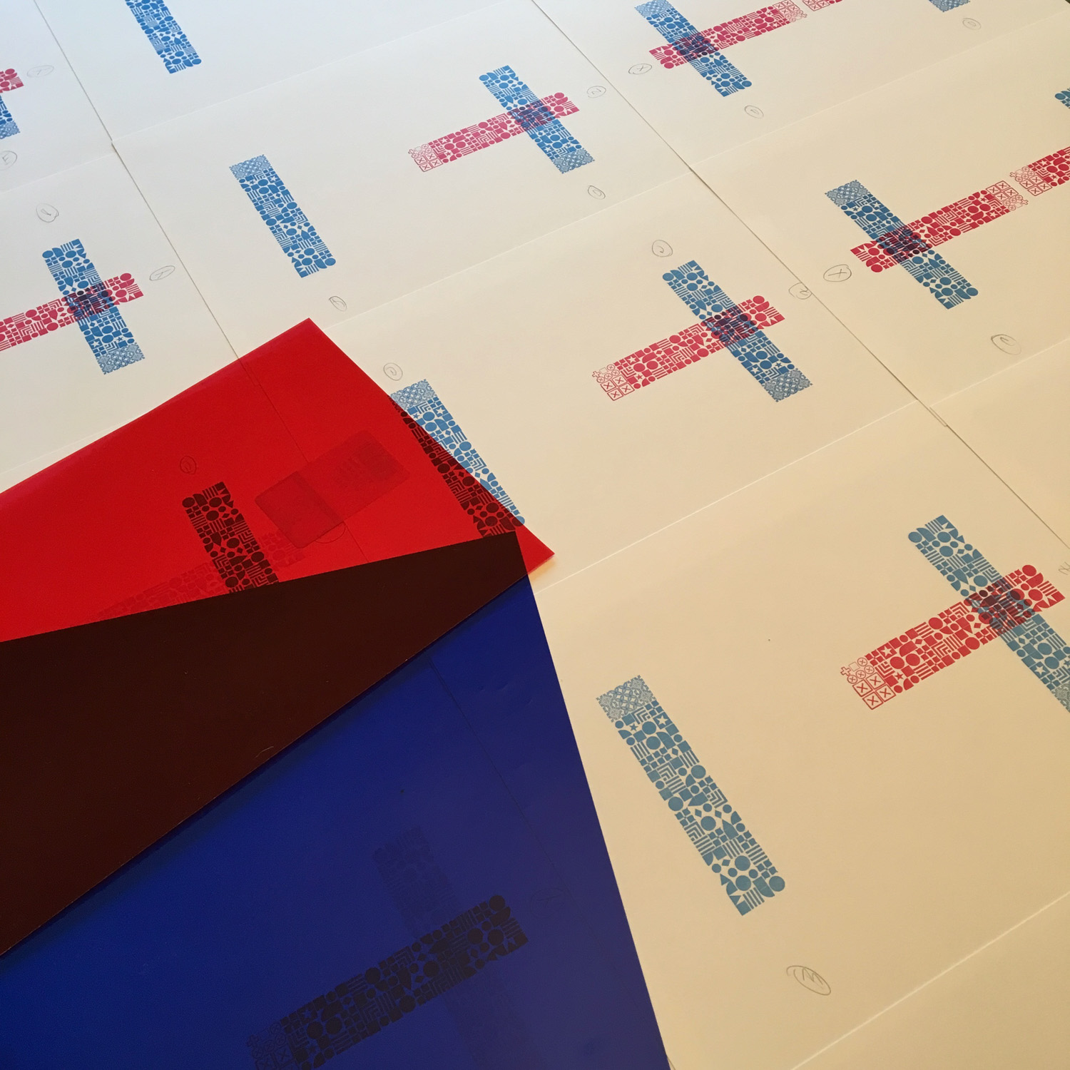
"Truth and Lies" is a letterpress print created in response to the 2016 presidential election and the ongoing treatment of facts by the current administration. After reading post-election analyses about information bias, echo chambers, and disinformation campaigns, aside from being generally discouraged about the state of our country, I wondered whether I could create a print that could be viewed differently when looking through visual filters. It would first involve some experimenting...
The goal was to find both the 1) right hues of red and blue ink and 2) right hues of red and blue plastic film that would allow matching colors to drop away and opposite colors to stand out. For example, when looking through the blue film, the blue ink would need to fade away while the red ink stood out.
I started looking at ink colors through each lens of an old pair of 3D anaglyphic glasses, and eventually graduated to plastic colored film. I tried a variety of both colored PVC film that could be purchased at craft stores and tried some gel filters for theatrical stage lighting.
Once I had a general idea of of the necessary color range, I performed a more detailed color test that involved 5 colors of blue and 3 colors of red. I spread all the tests out on a table and looked at them through red and blue filters. In the end I knew which plastic film filters worked best, and had two test prints that worked very successfully. I knew if I printed ink within the range of those two successful test prints the concept could work.
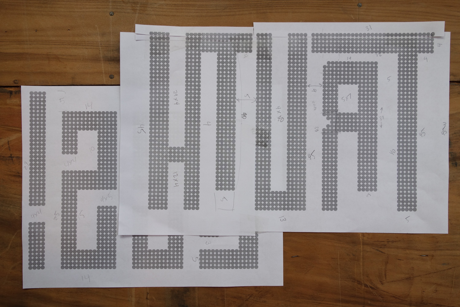
In the meantime I planned my letterforms. I don't often design letterpress prints on the computer, but in this case it really helped me plan the shape and overlapping of the letterforms. I used only 12 point circles on the computer to simplify planning and worked to fine-tune the letterforms. My goal was to streamline the shapes and minimize overlap, which would aid readability of the print when viewed without the help of the colored filters.
Once I was happy with the design it was time to set type!
The below images show the typesetting process, the resulting composed forms, and the forms on press. I printed out my color separated computer designs in reverse to aid typesetting. Lots of notes on pica measurements helped keep me on track. I used a variety of ornamental type with simple shapes to create the letterforms.
The typeform saying "Lies!" was printed first in blue ink, followed by the typeform "Truth" in red ink. Care was taken with each pass to double-check measurements and to plan for alignment of the two words.
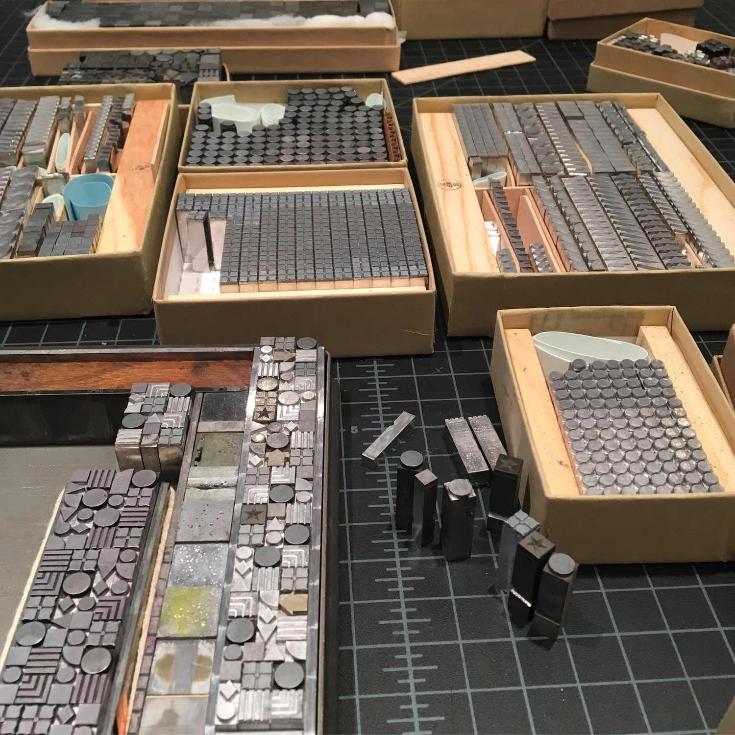
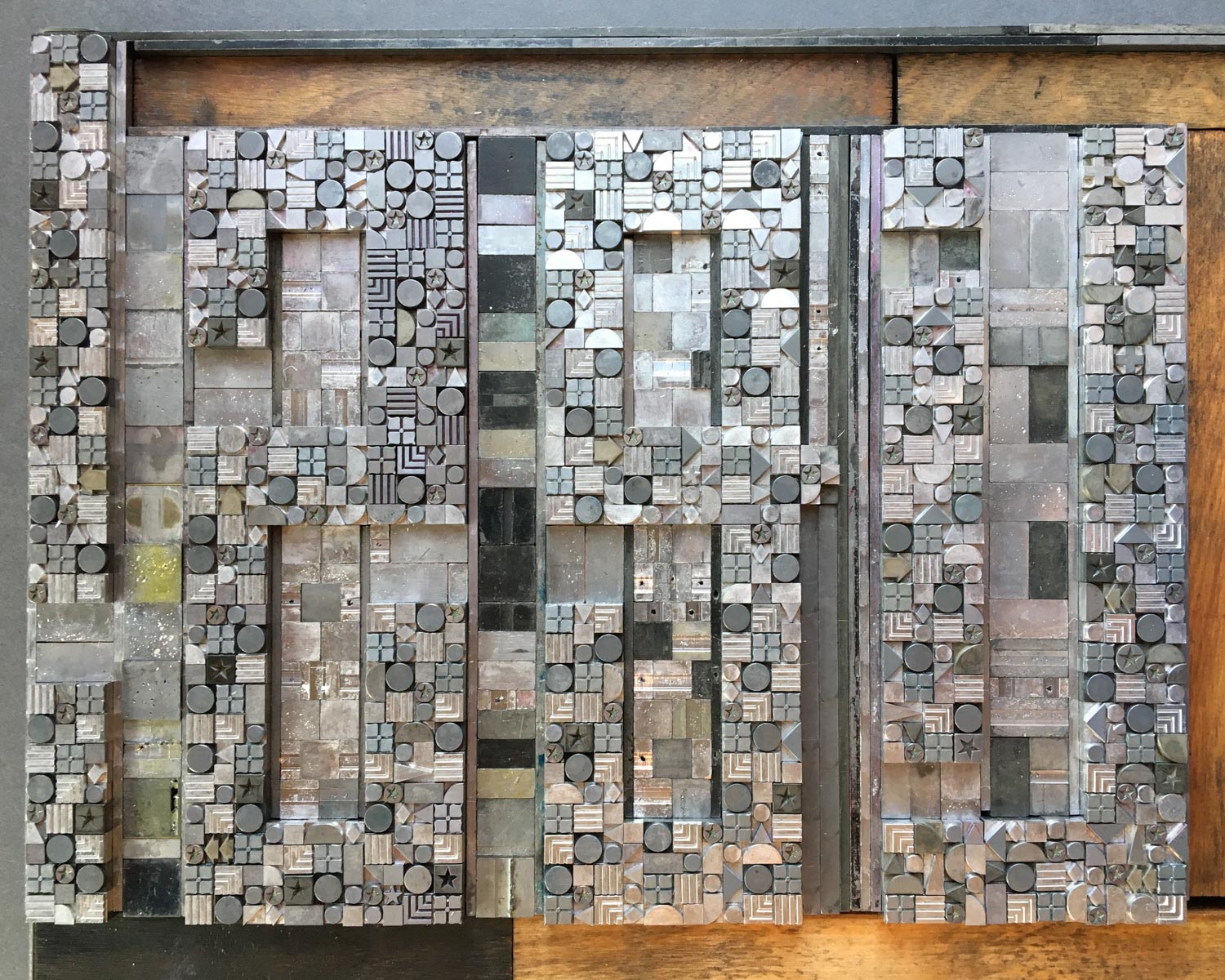

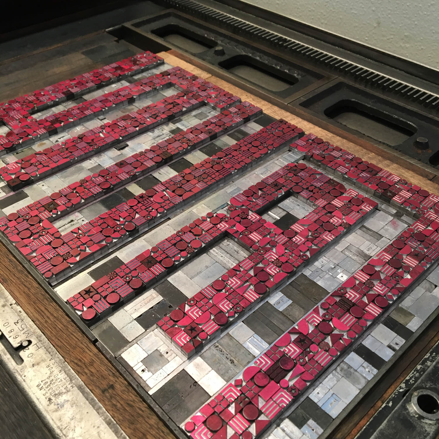
Fellow printers will appreciate that even though the "type math" should just work out in theory, the realities of Monotype cast at different times by different operators meant that type widths varied and making sure there was a 1 to 2 point tolerance in gaps between letterforms in the first pass gave wiggle room for registration in the second pass.
The following shows some make-ready where I'm checking the registration and noting which red columns of type need to move. Note that the red columns overlap slightly on their left sides and need to move to the right just a bit.
The print is entirely composed with handset metal type printed in two colors. Here's the final print shown with photos of each pass so you can see how they fit together.

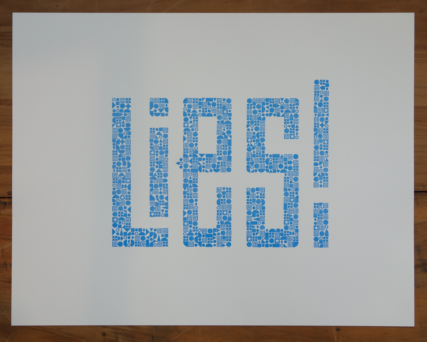
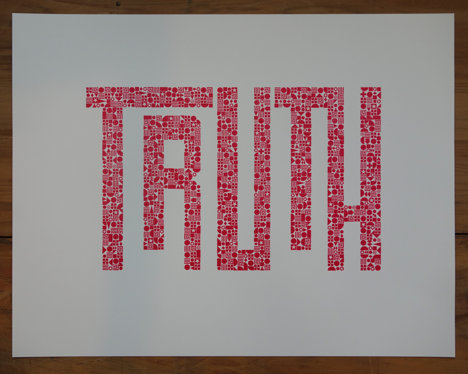
The print can be viewed on its own, or can be viewed through two accompanying handheld visual filters which will isolate the colors. The below images show what the print looks like through the filters.
It’s a chaotic world of information, but if you look closely you can tell the truth from the lies!


"Truth and Lies" is printed on archival paper in an edition of 50, in honor of the 50 states of the United States. Each print comes with two visual filters. This print is currently available for sale; see listing for additional details.


