I recently had the chance to spend the day visiting the Cary Graphic Arts Collection housed at the Rochester Institute of Technology. Located in the western New York city of Rochester, the Cary Graphics Arts Collection is one of the country's finest special collections libraries focusing on graphic arts. With over 40,000 volumes and an impressive collection of personal papers, I had a hard time fitting everything I wanted to see in one day. Hosted by the wonderful assistant curator Amelia Fontanel, I narrowed down my list, but the books and archive boxes still filled several tables in the previously neat and orderly reading room. I think my requests are filling about half of these tables!
I'll confess that I was so excited about looking at the items in the collection that I have only a few photos of the wonderful reading room and the adjoining press room. For a more proper overview I direct you to their facility tour (be sure to click on items in the photos for more information!)
Herman Ihlenburg Paper Collection
I spent the morning looking at a portion of the Herman Ihlenburg papers collection. Now I know you're thinking "Who?" which is a shame really, because even though not well known, Herman Ihlenburg was one of the most prolific type designers in American history. He is credited with over 80 typeface designs during the late 19th century. Originally from German he immigrated to the United States as a young adult and worked the bulk of his career with the largest type foundry of its day-- the Philadelphia based MacKellar, Smiths, & Jordan.
Ihlenburg designed type at a time that it meant not only drawing the design but engraving a metal 'punch' that would be then be used in the type creation process. And if you wanted an alphabet in 3 sizes, that meant engraving a punch for each letter of each size. William E. Loy in Nineteenth-Century American Designers & Engravers of Type suggests that "Not less than 32,000 punches have been cut by his hand."
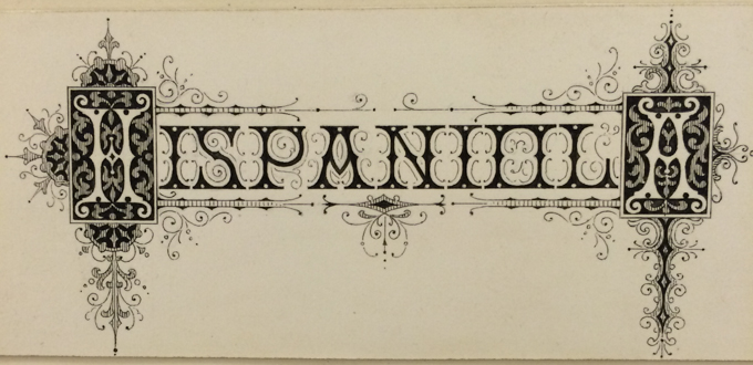
I'm sure you can now see why his papers might hold some treasures, and they didn't disappoint! One of the most interesting items was an album that held several hundred drawings of typefaces, most likely drawn during his employment for MS&J. Most of the items were ink drawings on Bristol board mounted in the album:
The designs are wonderfully elaborate, as was the style of the time...
There were also some drawings of streamer typefaces and borders. I liked seeing his additional notes on what sizes things should be.
Lastly, not in the album, but in another set of papers was a proof for several sizes of the typeface Filigree. This typeface attributed to Ihlenburg in 1878 comes with very elaborate initial capitals, only slightly less elaborate small capitals, and then a suite of ornaments to accompany the typeface. Here's a closeup of the proof in all its glory:
Albert Schiller
In the afternoon I switched gears and spent much of my time looking at the work of Albert Schiller. Albert Schiller was a advertising typographer and art director for the Advertising Agencies Service Company, Inc. in the first half of the 20th century.
Schiller became known for creating impressive pictures from type ornaments. All created from handset type the pictures he created were used for the company's holiday greetings and for other special occasions.
The Cary Graphic Arts Collection is lucky to be the caretaker of Schiller's personal archive, and I was a lucky visitor who got to see the prints. What follows is a few excerpts from three prints from the 1930s:
Interested in more? I encourage you to check out the Cary Collection's Online Exhibit of Albert Schiller's work.
But wait, there's more...
I managed to squeeze in looking at some type specimen catalogs, of which there is a large collection of hard to find specimens. And with that the day was done! It went by fast.
Next time I'd love to look at their amazing wood type collection and take more than a peek into their wonderful press room.


