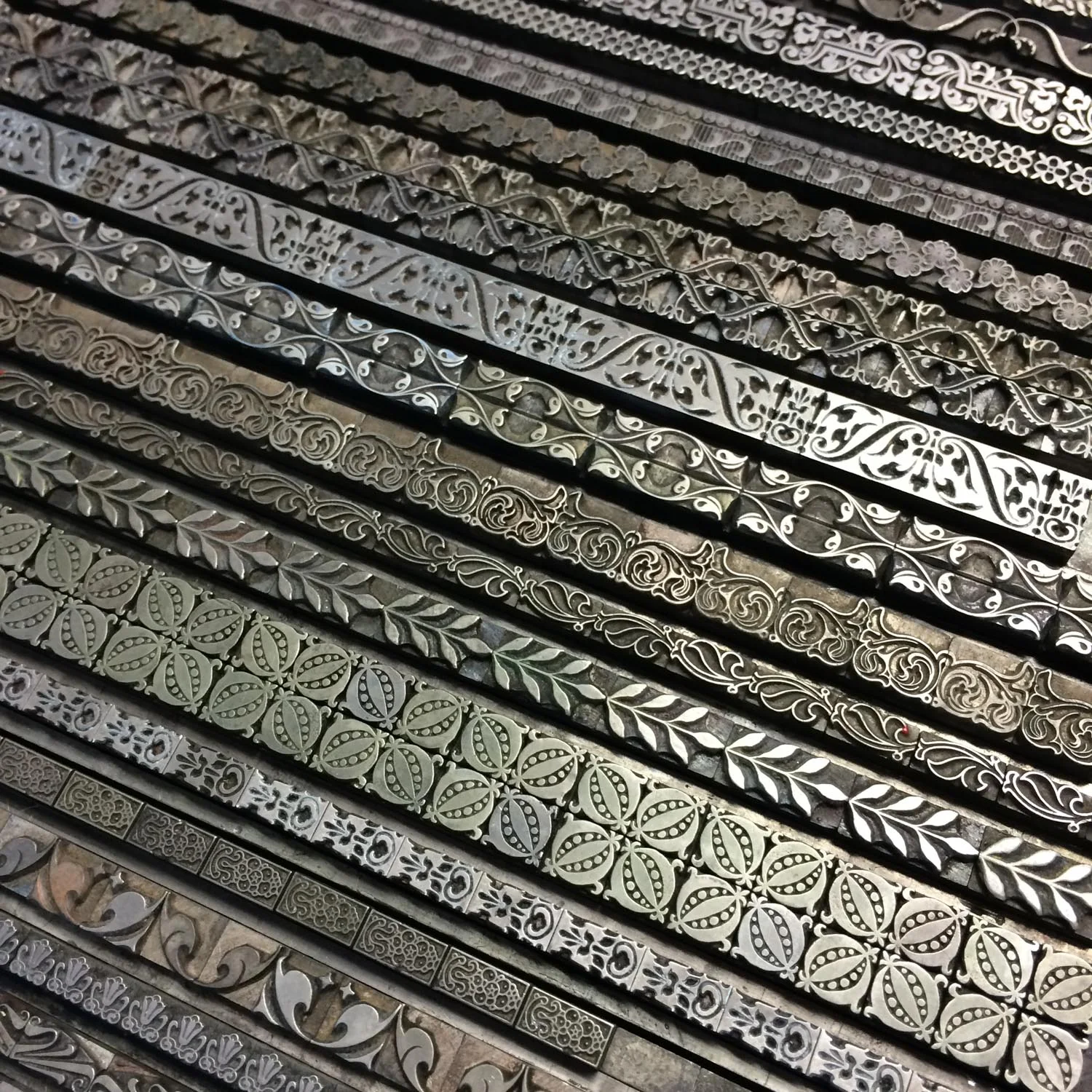
The School of Visual Concepts has a really nice collection of metal type ornaments. I’ve been wanting to work more with the borders specifically and decided to print a sampler– mostly for the sheer fun of seeing what they all look like, but also as a resource for future projects.
I poked through the collection and chose borders that I especially wanted to see printed, and then moved on to others that showed the variety of the collection. Many of the borders are designed to be used in different combinations and directions. I believe most of them have been typeset in a traditional way, but in some cases I doubled or tripled up a line for aesthetic reasons.
In the end I typeset 39 different borders. Most of the borders were created by the American Type Foundry in the first half of the twentieth century, although there are a few that are much older and may well be over 100 years old.
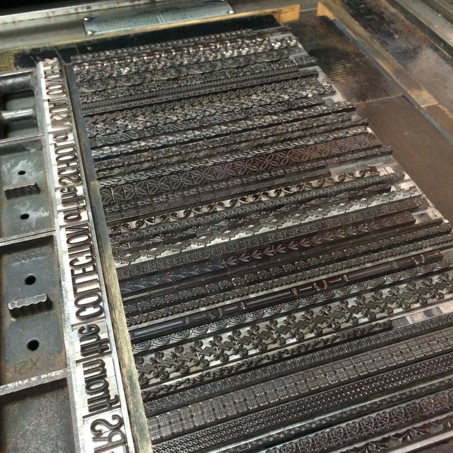
Here are the borders on press with title line set in 42pt News Gothic Condensed.
I assembled the typeset lines vertically. I like how they remind me of the visuals for a sound system equalizer or of a downtown skyline.
I printed two different versions: black ink on white paper, and silver ink on black paper. Both inks are Daniel Smith lithograph oil based ink. Both papers are Stonehenge by Legion Paper. It’s interesting to see how different they look. The white paper buzzes with excitement. The black paper recedes and lets the details of the metal type show.


