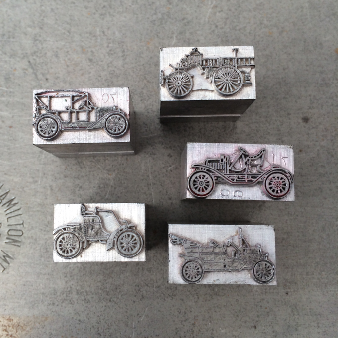
This card was inspired by a new acquisition of ornaments for the type collection of the School of Visual Concepts. They were... old-timey cars!
The design is simple, using rule and other ornaments to show the motion of the cars.
Different ornaments were paired with the cars. This one reminds me of a backfire sound.
This ornament is like a splash.
And arrows and other ornaments showed the motion of the little cards.
What I like about this card is that the design simple, just some rule and small amount of ornament typesetting, but I really like the end result.


