Now in its fifth year this project is a partnership between letterpress printers from the School of Visual Concepts and the Seattle Arts and Lectures' Writers in the Schools program. Pediatric patients work with poets Sierra Nelson and Ann Teplick to write poems as part of their stay at Seattle Children's Hospital. This is ongoing work for the poets who work with the patients. At year end a select group of poems are chosen to be illustrated in broadsides by letterpress printers and are bound in a portfolio. The poem I received was a lighthearted poem by a 15-year old named Trevor who worked with poet Ann Teplick. The poem is a series of playful alliterations. What follows is the process of how I printed this poem's broadside.
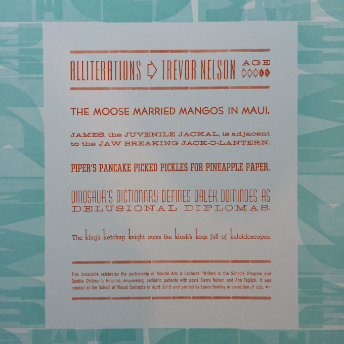
I love that the poem plays with letters, as that's what we do as letterpress printers! I knew right away that I wanted the only imagery on the broadside to be shapes of letters. I decided on a border of large wood type that would surround the poem. I used only the letters that the poet chose for his alliterations - M, J, P, D and K. I printed this pass of the broadside at Springtide Press and most of the wood type I used is from their collection.
I used a method called "work and turn" where each sheet of paper was printed twice with the same design in the press. On the second time through the press, the page was turned so that top was now bottom. This creates an effect which makes new shapes where the different letters overlap.
The poem itself was all set in metal type. The lines are justified to create a neat rectangle, and each alliteration is set in a different font to highlight the poem's playfulness with letters. It was quite a challenge to set all the type: each letter is handset one-by-one and in the case of this poem some lines were set five different times to eventually find a font that would line up just right.
The age of type used varies greatly. Some of it was cast as early as the 1880s and some as recent as the 2000s. The majority of it was designed and cast in the 1930s.
The metal type of the poem was printed on this Vandercook No 4 printing press at the School of Visual Concepts.
Here is the poem on press with orange ink.
And a close up of the type with ink.
The metal type presses the ink onto the paper as it is fed through the printing press.
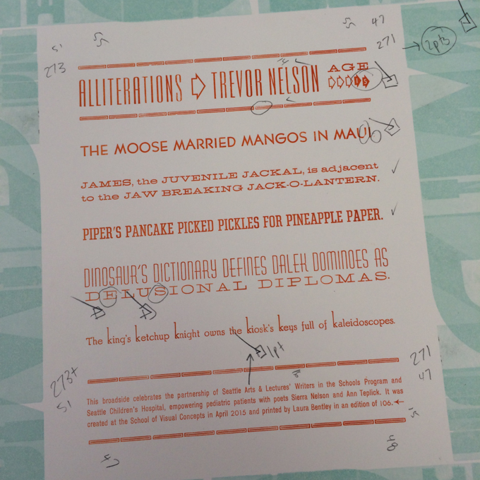
It's never as simple as just printing the type. Here's one of the early passes, and my markups showing what all needs to be fixed before printing the entire edition.
Once printed, the paper was trimmed down to 11 x 14 inches here at Pinwheel Press on my vintage Challenge guillotine paper cutter. I think those might be the prettiest offcuts I've ever cut.
Here is the finished poetry broadside. I am quite happy with the end result and hope that Trevor likes it.
Here's a closeup of the poem text.
And lastly a close up of the border and poem together.
It's truly an honor to work on this project every year. I thank Seattle Arts & Lectures, Writers in the Schools, Seattle Children's Hospital, the School of Visual Concepts' Jenny Wilkson, poets Sierra Nelson and Ann Teplick, and master binder Bonnie Norman Thompson of Windowpane Press for working together to create such a wonderful project. And I thank Trevor for such a fun and playful poem!


